

C-suite and sales heads need to make decisions fast and think on their feet. But it’s hard to do that when all you have are endless rows of data records.
You need a readily available 10000 foot-view of performance for teams, departments, and business units that you can act on.
That’s something Reports and Dashboards do for us.
It allows you to customize your screen to bring attention to key metrics, especially the important ones for multiple business units and departments, thus great for quick actions that need attention.
What reports are used by sales teams
To make the most of your sales data, sales teams strategically choose the right kind of report to view and analyze their data.
The ‘track-worthy’ sales metrics change from company to company. This kind of intentional approach helps them to pull insights and meaningful information, instead of dealing with an overwhelming pile of data.
So, considering the importance of data, we’ve narrowed down 11 types of reports that business owners and sales heads need to see a 360-degree view of their business.
Examples of essential Reports and Dashboards used by teams to check Sales Productivity
Salesforce provides you the ease to set up and view your data in any of these forms of reports, provided you know the right way to analyze different types of data.
#1. Lead Volume by Source
Key metric:
The report shows the number of leads collected during a specific period of time from different sources.
Why it’s important:
Marketers tend to use many platforms to generate leads (MQL), be it social media, content marketing, or pay-per-click ads. There are always some sources that generate more leads than others and this report helps to identify that.
#2. Lead Generation versus Conversion
Key metric:
This report shows us the total number of converted leads against the total generated lead in some specific days, months, years, or quarters, as well as lead generated by different sources.
Why it’s important:
It helps us understand the returns on leads captured from the different lead sources that a business spends on.
#3. Churned Customers Report
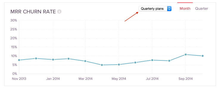
Key metric:
The report helps to determine where you’ve lost customers by identifying gap areas and sources that contribute most to churn – you can view churn by specific salespersons, industries, or products.
Why it’s important:
A churn report can help you monitor and fix different sources of churn on time by turning attention to things like bad sales processes, industry pain points, or product offerings.
#4. Sales closed by account managers
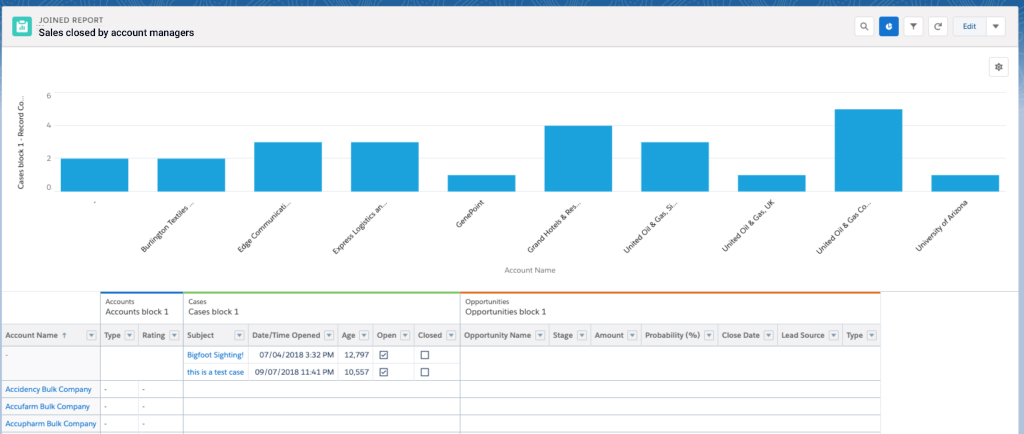
Key metric:
This report tracks how many opportunities were won by which Account Manager and totals sales value generated by each account manager in that time frame from different sources (parameters) like industries and products.
Sales value can also be calculated quarterly, half-yearly, and yearly. Month-over-month and Year-on-Year sales values can also be compared.
Why it’s important:
This tells us which manager needs the most help and which ones deserve a bonus. Leading account managers can be asked for feedback. The report also gives teams an opportunity to check lead distribution.
#5. Pipeline by team member

Key metric:
This report shows the value and number of open opportunities that a team member has across different opportunity stages.
Based on the criteria applied, we can also see the value of the opportunities being closed along with the number of opportunities being closed in the next 30-45 days.
Why it’s important:
Sales pipeline is arguably your most important sales team KPI. Obviously, pipeline translates into sales.
It also shows you which opportunities have a higher probability of conversion and should be focused on. This kind of user-level pipeline data also helps to identify discrepancies in your opportunity pipeline.
#6. Month Wise sales revenue
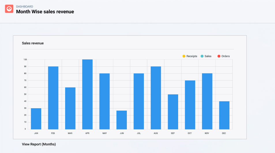
Key metric:
Depending on the criteria applied, this report shows you revenue contributed by a specific department or business unit, group of business units, or the entire business.
Why it’s important:
This report helps you compare monthly revenue by different business units month-over-month. It also tells you the most important months in the year for sales teams in different business units to plan their yearly holidays, peak selling times, and other events.
#7. Typical conversion rates report
Key metric:
This report shows us the typical conversion rates of different team members, business units, or across the company.
Why it’s important:
It provides insights into a team member’s or business’s ability to convert prospects into leads and leads into customers. It also tells you how efficient individual and overall strategies are.
The report helps teams identify where they are weaker in the sales cycle.
#8. Average deal size report

Key metric:
The report monitors average deal sizes for a recent time period across different industries, business units, and sources. These reports help to monitor which sources have smaller deal sizes.
Why it’s important:
This helps you identify which business units, industries, or products need to improve their cross-selling and pricing or package their offerings better.
It also helps to set expectations and milestones for sales quota to consider for your next sales cycle.
#9. Win rates

Key metric:
This report shows the number of won opportunities divided by the total number of opportunities.
Win rates can be calculated and compared for individual team members, teams, business units, target industries, products, and service offerings.
Why it’s important:
Sales representatives are highly competitive and always work on making their bonuses. Win rate data helps them to always stay one step ahead of their pipeline. If on average 50% of your opportunities convert, sales reps need to have at least twice those deals already lined up.
#10. Lost opportunities by reason

Key metric:
The report shows all lost opportunities along with the reason
Why it’s important:
To maximize sales, it is important to understand buyer motivation.
Tracking specific reasons for losing an opportunity give sales reps data-driven insights into buyer behavior. This information can be used to deliver services and products that could resonate with potential buyers.
#11. Target Sales versus Actual Sales Report
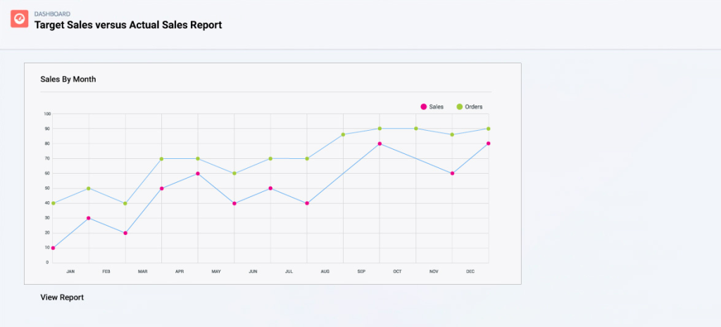
Key metric:
This report tracks monthly sales against targeted sales each month to analyze which months tend to be off-target and which ones result in peak sales.
Why it’s important:
It tells business units which months need more sales opportunities and leads in the pipeline for consistent sales.
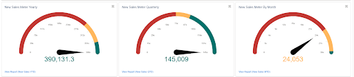
This report can be viewed together with Yearly, Quarterly, and Monthly sales meters to evaluate sales success.
Wrapping Up
We’ve implemented several thousands of custom as well as standard reports and dashboards for sales teams depending on their strategies and unique needs. From experience, we can say this has helped our customers make faster decisions and make improvements to their sales processes.
Awards & Accolades


Got a Question? Ask Us!
Ready to Solidify Your Digital Transformation Efforts Using Salesforce? Talk to Us!

Subscribe to our newsletter
Stay ahead with expert insights, industry trends, and exclusive resources—delivered straight to your inbox.